




ADVERTISEMENT
New York Fashion Week is rethinking jewel tones
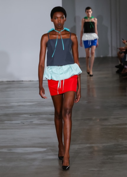
From peacock blue and deep ruby to turquoise, violet, and tomato red, New York Fashion Week is giving jewel tones a less predictable makeover.

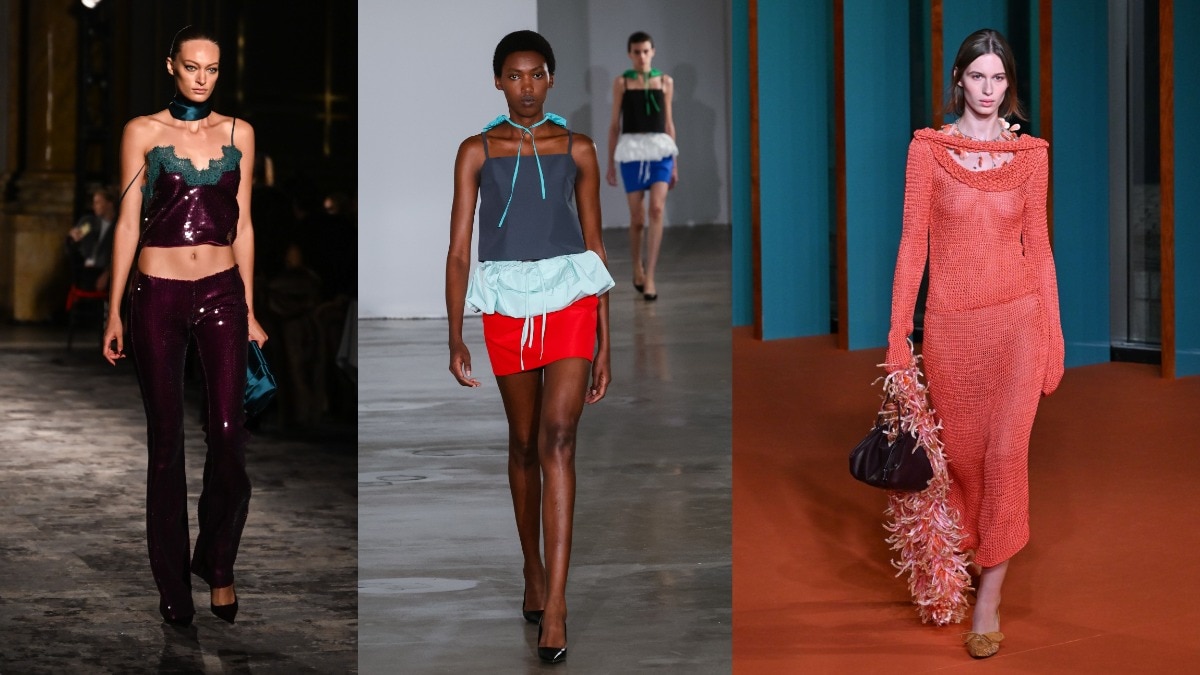
Jewel tones have always come with instructions. Ruby with gold, emerald with velvet, sapphire with satin; the richer the colour, the more elaborate the outfit tends to become. But this season, the shades are escaping that very specific dress code. At New York Fashion Week, the shades are appearing not as shorthand for evening glamour, but alongside sporty shapes, denim, crisp whites, and unexpected colour combinations.
It is less a comeback than a rethink. These are colours we already know, but they're being stripped of the styling that made them feel so familiar. Back home, where ruby, emerald, sapphire, and peacock blue have long lived in our textiles, jewellery, and craft, the shift feels particularly interesting: something so recognisable suddenly looks quite new.
Forget matching, start clashing
The SS27 runways were generous with colour, but rarely in the expected combinations. Tory Burch moved between violet, turquoise, azure, vermilion, coral, and marigold, allowing saturated shades to sit next to each other rather than carefully coordinating them. At Bad Binch TongTong, red met teal while blue appeared with highlighter green; LII put red and blue through sporty silhouettes and vinyl. The effect was less jewellery box, more colour experiment.
Michael Kors took another route, setting red, green, yellow, and blue against black and white. The colours became almost graphic elements of the clothes. Across the shows, the message was similar: a rich colour doesn't have to make an outfit formal. Sometimes it can make it stranger, sharper or simply more fun.
The unofficial shows are making a case too
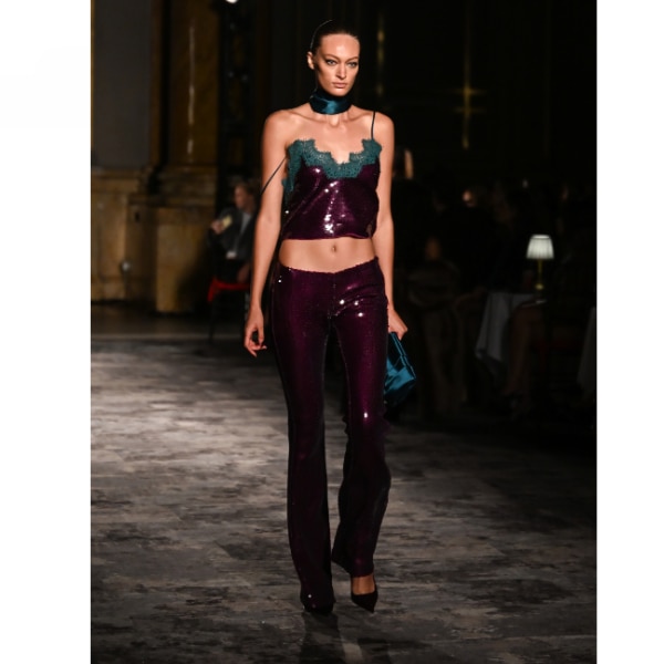
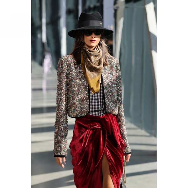
The trend isn't confined to the official NYFW schedule. RetroFête's Fall 2026 showcase, which was part of the surrounding, unofficial fashion-week circuit rather than the SS27 calendar, offered another interpretation of the mood. Sequins, lace and deep jewel shades could have easily veered into traditional occasionwear, but the styling kept them feeling more contemporary.
Celebrity stylist Nishtha Parwani, who picked the collection as one of her references for the trend, particularly liked that the colours weren't treated as occasion-only. “These shades look beautiful in velvet, lace, silk, satin or even leather,” she says, “but they can feel equally modern when brought into everyday pieces and worn with simpler, more casual elements.”
That idea is perhaps why the colours are landing now. They have the visual richness of something special, but don't necessarily require the commitment of dressing for something special.
How to break the jewel-tone stereotype
Parwani's easiest styling trick is to throw denim into the equation. A peacock-blue shirt with relaxed jeans or a deep-ruby top with vintage-inspired denim immediately changes the context. She also suggests crisp white, oversized proportions, sculptural tops and relaxed tailoring. Instead of matching the colour with equally ornate pieces, give it something more pared back to push against.
The more adventurous option is to combine the shades themselves. Parwani likes peacock blue and deep ruby together, but recommends letting one lead while the other becomes an accent: a peacock-blue shirt and jeans with ruby heels or a statement bag. “The denim keeps the combination grounded, while the ruby adds that unexpected hit of colour,” she says.
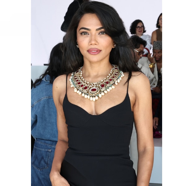
The same thinking applies to jewellery. Mona Patel's maximal, sculptural approach to dressing is a useful reference for how colour can work alongside statement accessories without everything being perfectly coordinated.
Even Sabyasachi's return to NYFW after 18 years brings the relationship between saturated colour and jewellery full circle: his presentation coincided with the debut of his high-jewellery collaboration with The Metropolitan Museum of Art, inspired by Byzantine art and objects from its collection.
The point isn't to retire emerald, sapphire, or burgundy. It's to stop dressing them according to a rulebook. This season, ruby can meet denim, peacock blue can sit beside an unexpected shade, and turquoise doesn't have to wait for evening. Jewel tones are still doing what they have always done—making clothes feel richer. They're just having considerably more fun with it now.
Lead image: Getty Images
Also read: Is playing it safe on the red carpet the new ‘chic’ trend? The 2026 Emmys might say so
Also read: The fringe effect is taking over this season’s dresses
ADVERTISEMENT
Must Read

ADVERTISEMENT