Portofino orange: Taylor Swift’s “The Life of a Showgirl” signature shade is taking over social media
Orange is no longer just a colour—it’s Taylor Swift’s next chapter. After the recent debut of 'The Life of a Showgirl', Portofino orange is now challenging Pantone’s Mocha Mousse as the hue of 2025.

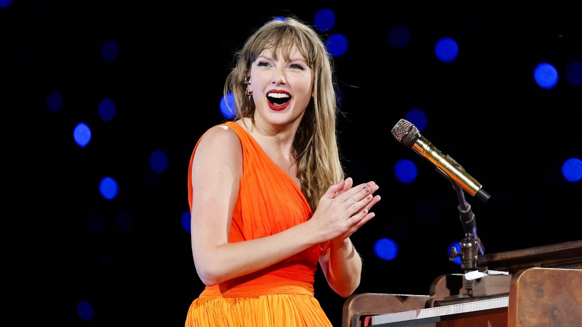
Taylor Swift has long been known for her mastermind to encode meaning into even the minor details of her eras, from lyrics to aesthetics—nothing is accidental, and her latest album, The Life of a Showgirl, is no exception. This time around, the defining shade is Portofino Orange—a hue Swift described as “energetically how my life has felt” in her nearly two-hour appearance on the New Heights podcast, hosted by her boyfriend Travis Kelce and his brother Jason. “I’ve just always liked it, Jason. It feels exuberant, electric, vibrant—and this album is about what was going on behind the scenes in my inner life during this tour,” Taylor explained. For those of us still staunchly wed to Millennial Pink, it’s time to shift to citrus.
Swift is known for her colour-coded eras—Reputation in black, Midnights in midnight blue, and now The Life of a Showgirl in Portofino orange, to name just a few.
The Build-Up: Orange Clues in the Eras Tour
Long before the official announcement, Swifties around the globe had begun connecting the dots. Many fans recall how flashes of orange began appearing more frequently as the tour reached its finale: An orange suit appeared during the Lover set, an orange dress made its debut during the Folklore chapter, and a glowing orange door in the finale hinted at what hue might be on the horizon.
Even the Eras Tour official book featured hints of the shade.
And of course, eagle-eyed Swifties recall her wearing orange in the Look What You Made Me Do video, suggesting the colour had already been lurking in her palette, quietly waiting for its moment.
The Symbolism
Orange is often associated with vitality, creativity, optimism, and transformation—themes that align with Swift’s description of the album as upbeat, electric, and reflective of her offstage life.
Launching the era in the autumn only deepens the connection as orange ties naturally to the season of change, harvest, and renewal. Swift’s shift from her signature red lip to a terracotta shade in the promo is also far from accidental.
Beyond The Swift Sphere
The Portofino Orange effect has gone viral far beyond the Swiftie community. Almost instantly after the announcement, major corporations jumped on the trend, flooding social media feeds with orange-hued posts: Shake Shack, FedEx, Cinnabon, Walmart, Netflix, a variety of NHL teams, X, and Google joined the orange wave. This mass brand participation just highlights Swift’s rare power to set not just musical, but cultural and commercial trend storms. What was once just a colour choice has now become a viral marketing palette.
This article originally appeared on HarpersBazaarArabia.com
Lead image: Getty Images
Also read: Kajol in all her glory—untamed, unfiltered, unforgettable
Also read: Why Sex and the City still defines modern womanhood